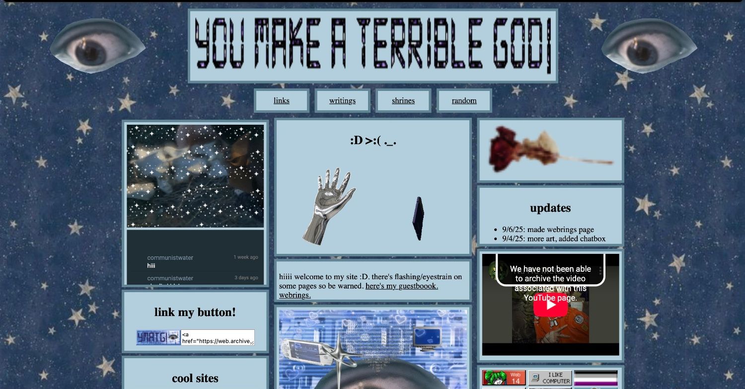
so here's the illustrated history of communistwater.neocities.com and my poor design choices regarding it (mostly the index page.) most of this is from the wayback machine but a bit of it is from my brain so it may be inaccurate.
start: late june 2025. (there's no wayback machines of it until sept 13 2025 or other images so ill just describe it verbally or linguistically or whatever.)
so when i started to css this cite it really sucked. the background was just an iphone wallpaper of a circuit board with really bad color cohesiveness. i also made a title box with the same glitter text maker i have on my current title (as of febuary 15 2026) but it was in a gothic font and in black (instead of purple-black) which made it sorta unreadable and jsut really crusty. but the next day i changed it to the blue star background and the solid cyanish border that has existed for the majority of this site (until an hour before i wrote this.)
between late june and september 13 2025
i dont really remember what i did. the updates log on the index says i added the first 3 writings (besides the rant against webps which sucked and i deleted it.) and the first 2 urbexes. and basically most of the site. i also changed the music on the index from insect by switchblade symphony to nu nu meta phenomena by machine girl.
sept 13 2025
  |
h |
more siteslop just to take up my storage and make more pages.
